Cup of Tea
Role → Product Designer
Timeline → Mar 2018–Jun 2018
Team → INFO 490
An intentional dating app to brew a more meaningful match
Background and class context
Cup of Tea is a quarter-long project for a class titled Rapid Prototyping. The premise of the class was to design an app from the ground up with no restrictions as to the type or subject matter of the app.
My team, aptly named Team Espresso, chose to tackle the problem of online dating in the 21st century. Because of how competitive the space is, we had to come up with plenty of ideas to differentiate ourselves from the rest. Read on for a case study on our app, Cup of Tea.

01
Problem
The dating app space is a huge market because so many people are looking for the promises of what it claims to offer: love, companionship, intimacy, etc.
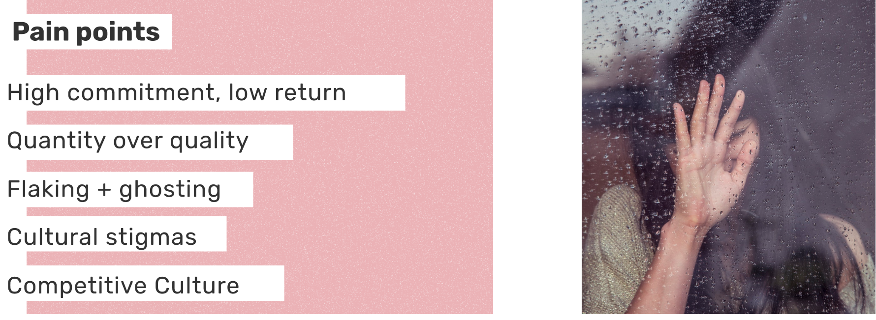
Current solutions are frustrating and borderline toxic due to a large number of reasons, outlined below. We intended to design a solution that combats the negatives of current solutions while still being fun, but healthy and positive.
02
Comp. Analysis
In order to find the more embedded issues with the current dating app experience, we dove deeper into the market and did a competitive analysis of some of the more popular dating apps via research methods like surveys, interviews, and real world use. These include Tinder, OKCupid, Coffee Meets Bagel, and Bumble.
03
Personas
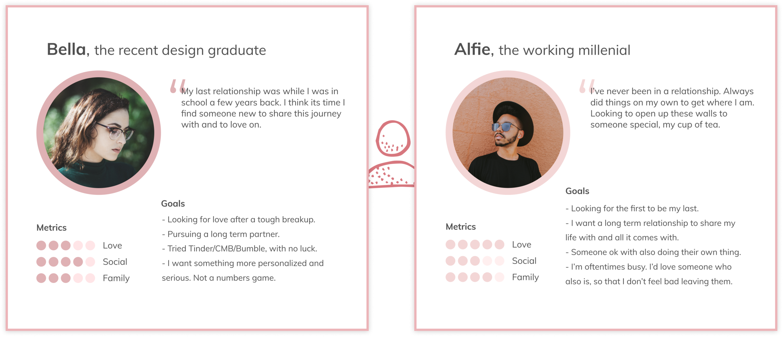
Our process started with formulating a couple personas to help guide the content of the app. Because of the nature of our dating app, having two personas intuitively worked out as we framed our user journeys around the two of them interacting as each other's match.
04
Features
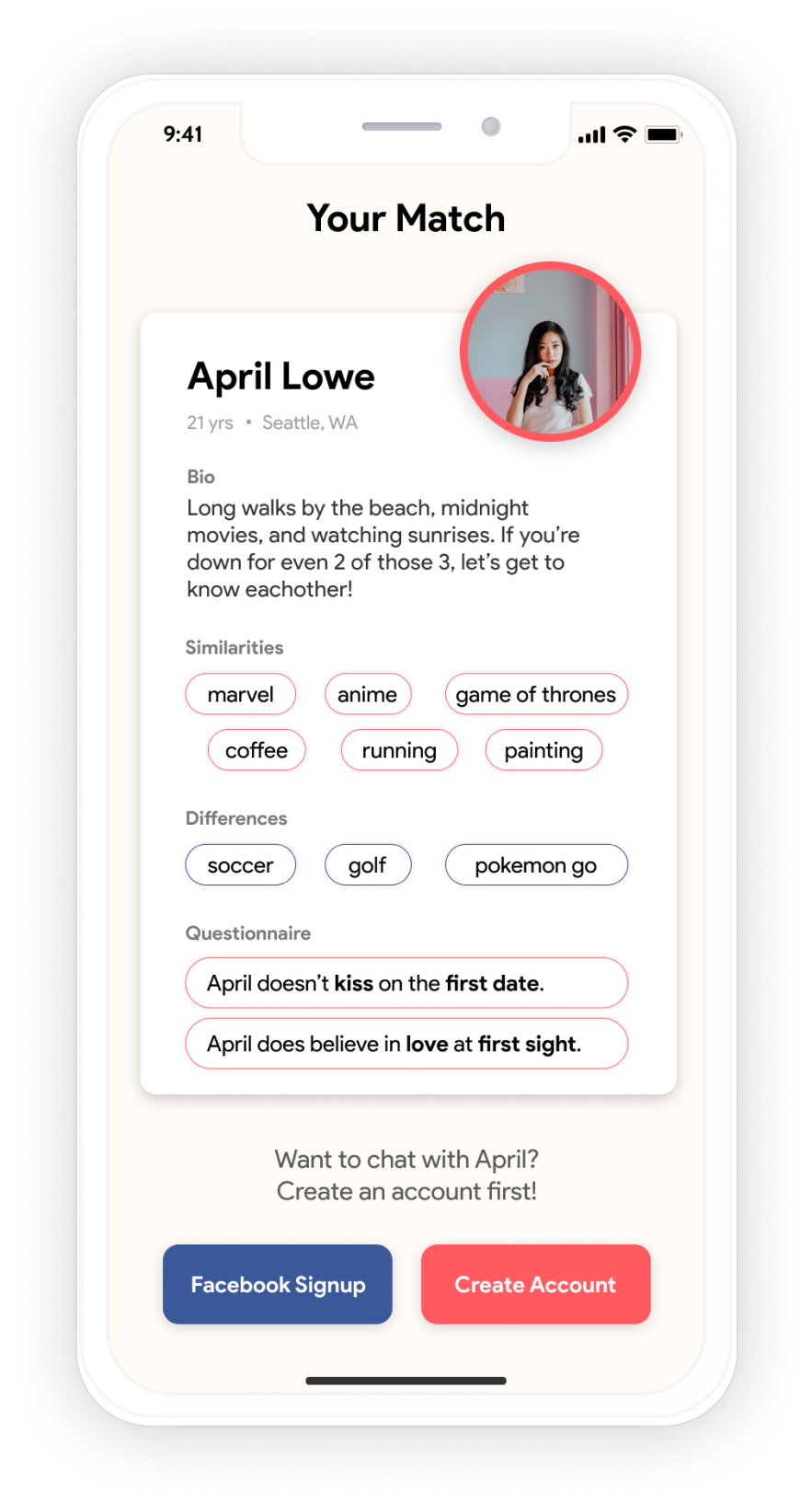
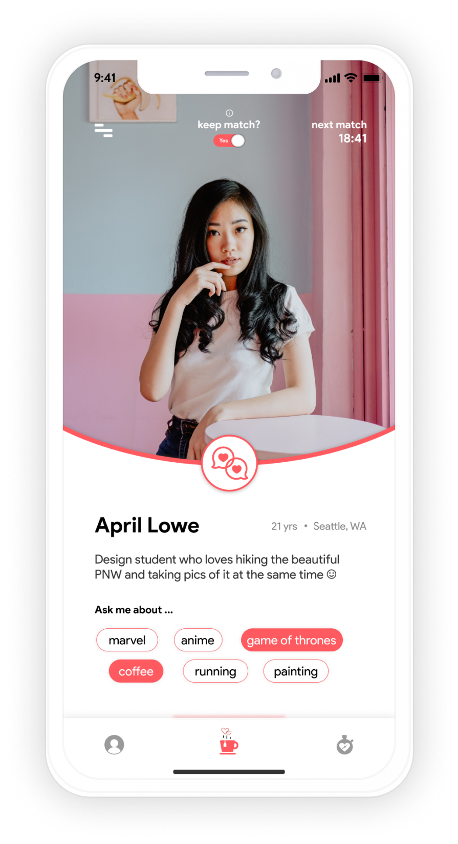
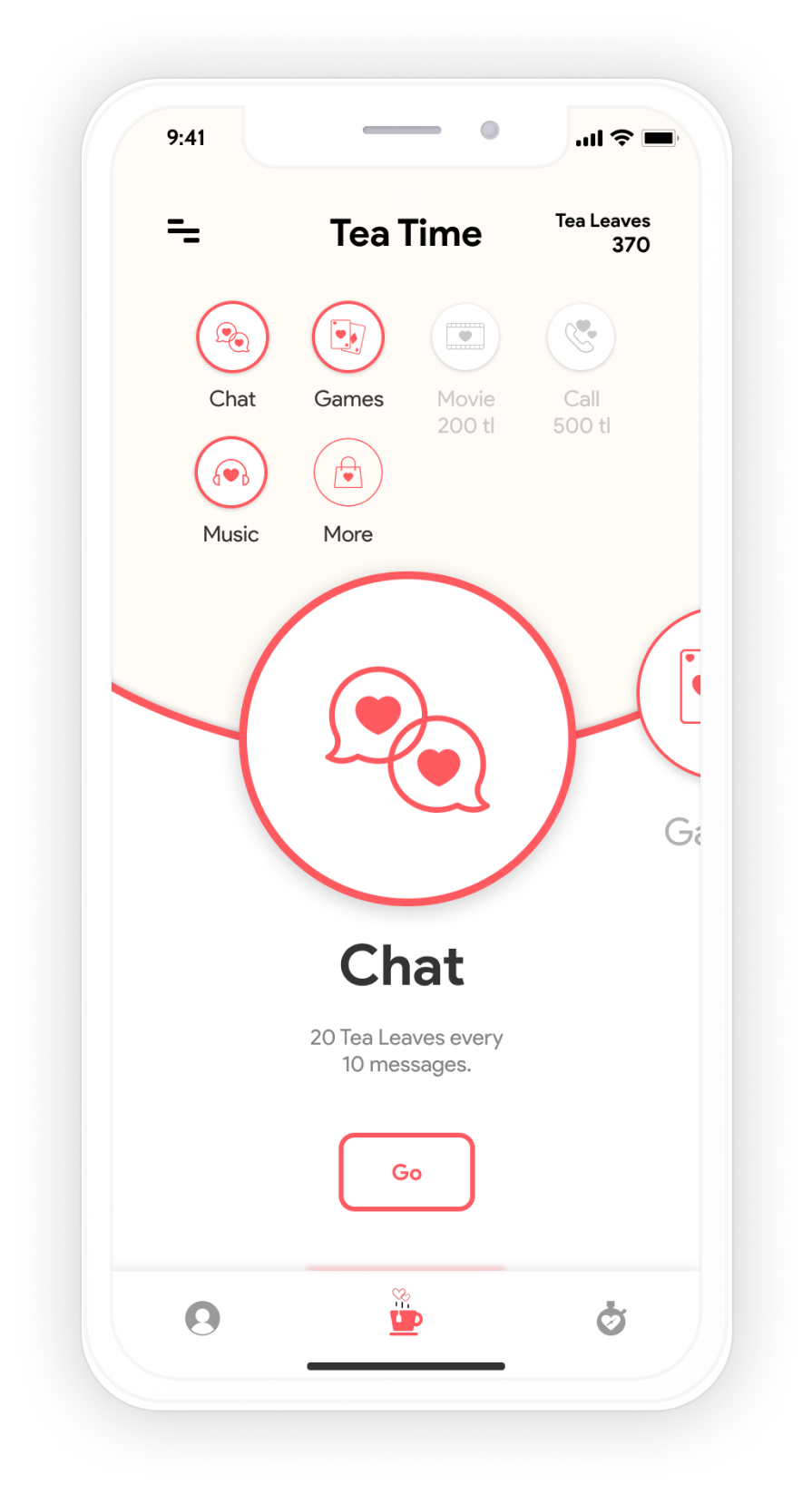
Cup of Tea is a dating app where users will match with one person every 24 hours based on similarities and differences. During this time, couples will partake in a “virtual date”, where they can interact in fun and engaging ways to foster a strong relationship.
05
Ideation
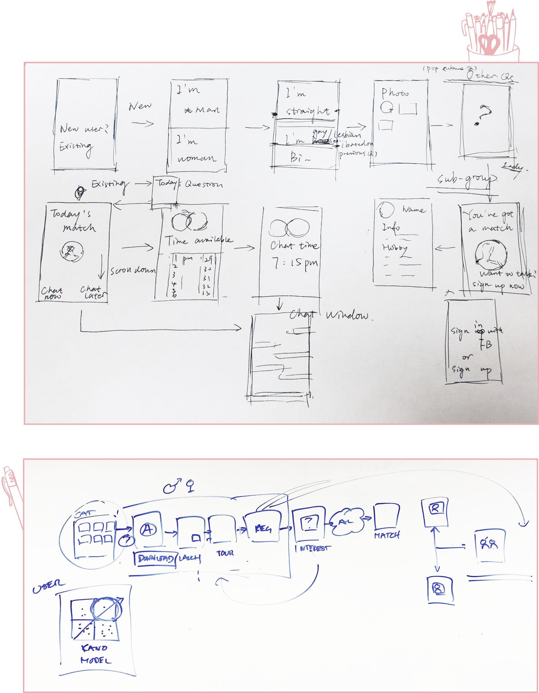
During the early stages of the project, we spent a lot of time nailing the user flow of our app first. Some key takeaways here include:
Knowing where and when to have the on-boarding questionnaire
Putting the sign-up page after the questionnaire and initial match, and not in front
This further incentivizes users to sign up because they see their match
Added an initial tour off user feedback to explain the survey and match
06
Lo-fi design
Based on the above flow sketches, I crafted a finalized digital flow to map out how our users will go through our app. We ran into some trouble here as a team because we couldn't agree on stylistic choices for the lo-fi designs.
For example, our initial name for the app wasn't Cup of Tea, but Blossom (inspired by the University of Washington's cherry blossoms, which were in peak blossom at the time).
07
User testing
We ran a total of 3 usability tests with 5 different people each, totalling 15 different users. The 3 tests were all unique in that we tested different phases of the app, those phases being:
Onboarding phase
Questionnaire phase
Interactions phase
08
Stylescape
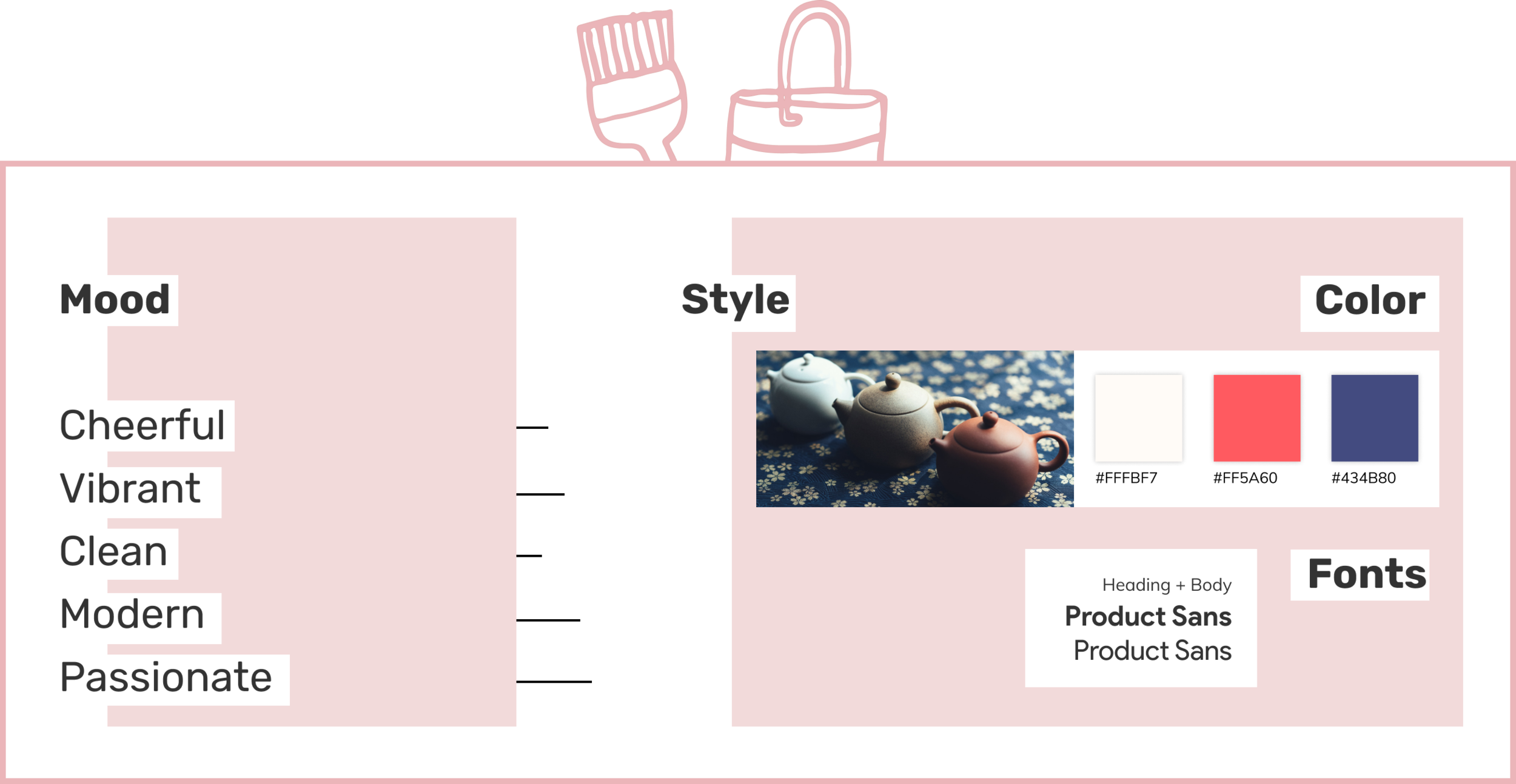
Our biggest stylistic change was in the branding of our app. We went from Blossom, a name we thought was too formal and boring, to Cup of Tea. The following is the style-scape I came up with for our new app.
09
Hi-fi design
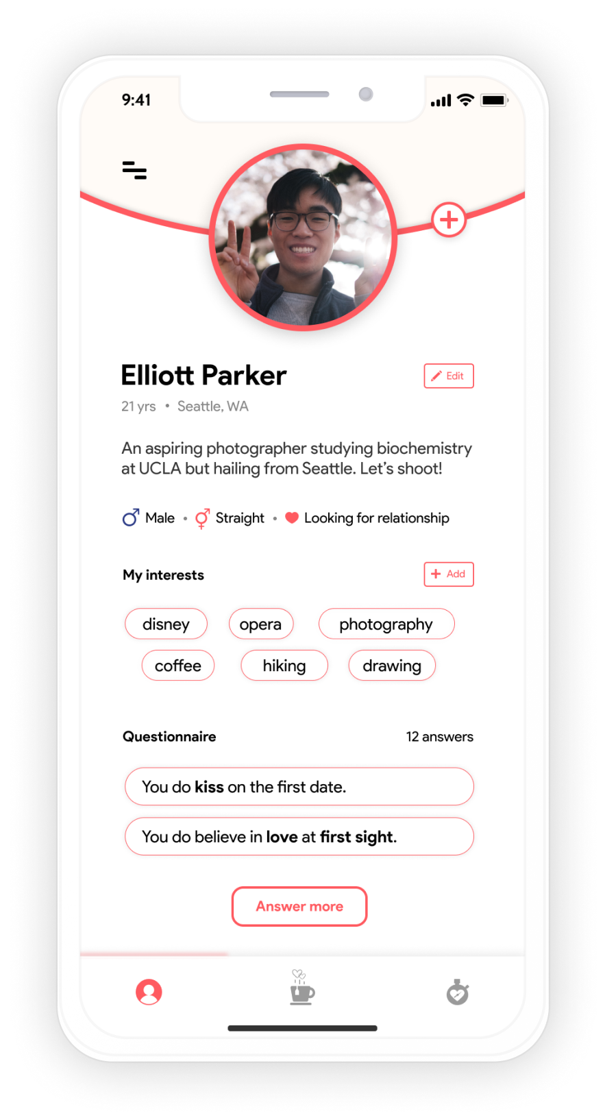
My final high fidelity screens with a working prototype below. Designed for the iPhone X to stay up to date with latest tech and design updates.
In reflection...
Cup of Tea has easily been the most rewarding design project I've ever had the pleasure of working on here at the UW. Taught by a past mentor of mine, Brian Fling, a veteran in the mobile design space, he always gave us incredible insights that we all took forward into our young careers.
The biggest takeaway from this entire project has been the fact that designs are living things. They are constantly changing and iterating, for better or for worse. In our case, the three usability tests we ran with 15 people led to so many drastic changes here and there that bettered the app. Without the insights of our testees, whose backgrounds were all over the place, we wouldn't have been able to see obvious pain points and additional features.
